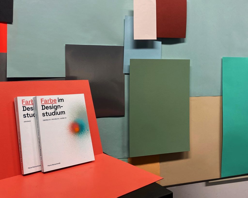
Color in Design Studies
Master thesis, FH Potsdam 2024
Color is a key element and of great interest in design. Color decisions have a significant impact on the result, its effect and aesthetics, its legibility, its affiliation, its usability. Color directs the eye. Color helps structuring content. Color is able to create atmospheres and even influence well-being. A decision against chromatic color is also a color decision.
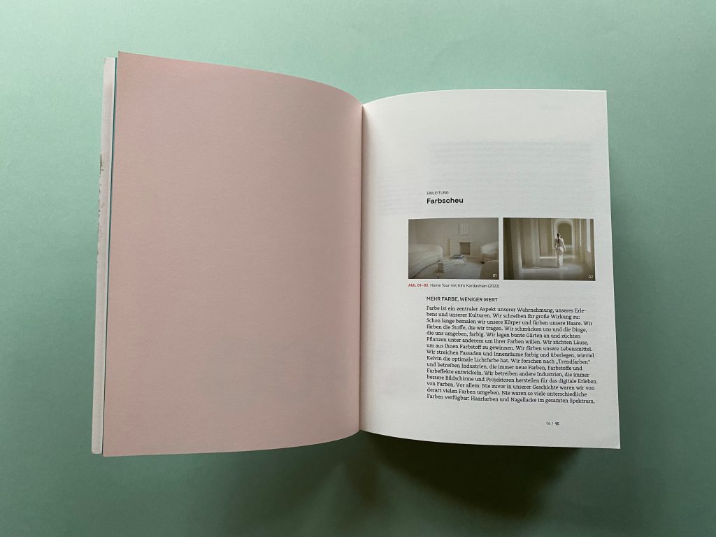
Culturally there is a deeply rooted reservation about color in Western thinking (Batchelor 2002). Anything too colourful deems us dubious, shrill, cheap, childish, folkloristic, or queer. Color, like ornament, is associated with decoration, masquerade, or illusion. It pretends to be what it is not. It conceals what is real and true. Color also carries the risk of spoiling everything. It can take away the appetite. It can make you look ridiculous. When it comes to design decisions, especially in pricy and long-lasting items, a neglect of color has become the norm: deciders prefer to resort to the achromatic spectrum rather than facing the dangers of clumsy coloring. The results are grey façades, grey cars, white hospital hallways, black suits. Chroma is only accepted when strictly functional: Stop! Poison! Emergency exit!
In recent years, various teachers and researchers have identified a considerable lack of contemporary color education within academic design curricula in various countries excluding Germany (Calvo Ivanovic 2024, ibid. 2022, Csillag et al. 2018, Hirschler 2018, Willard 1998). My thesis examines the situation specifically at public universities and art schools in Germany and aims to fill a research gap.
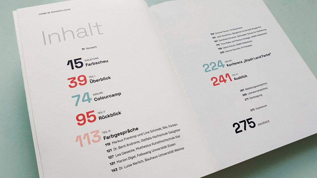
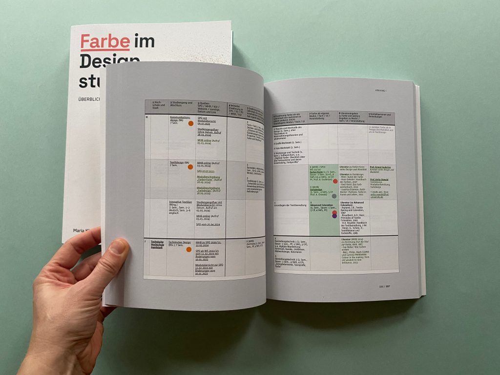
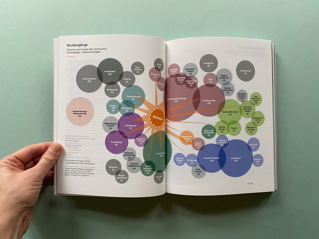
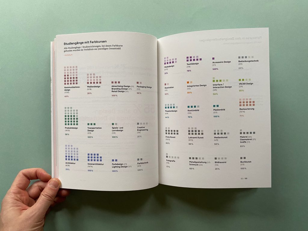
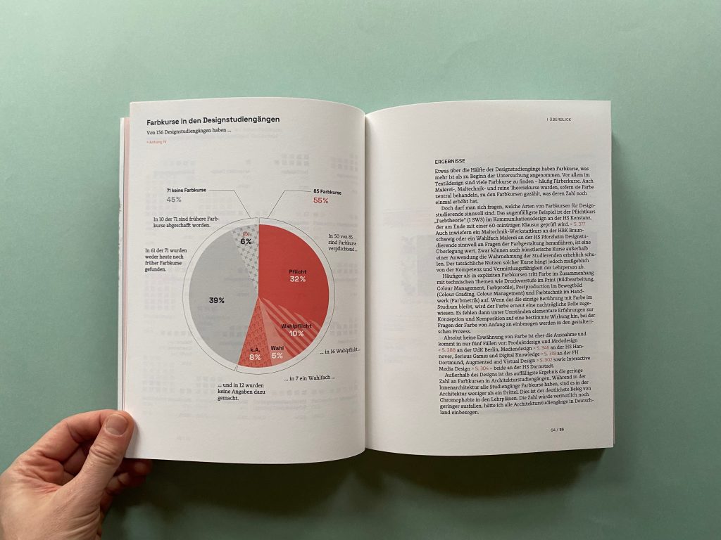
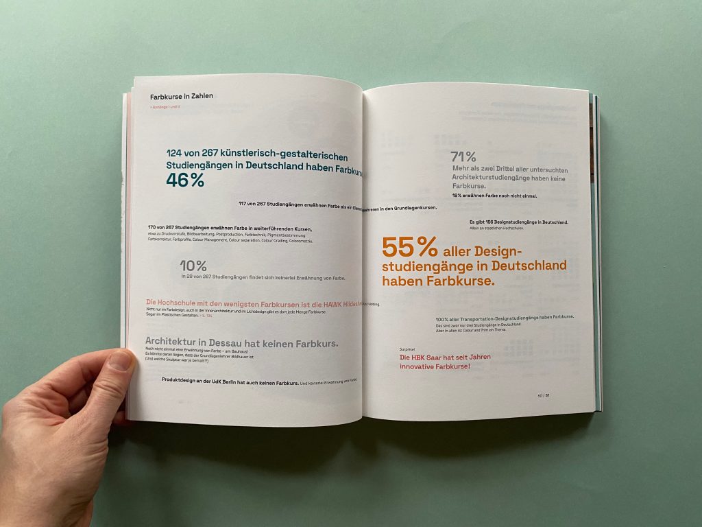
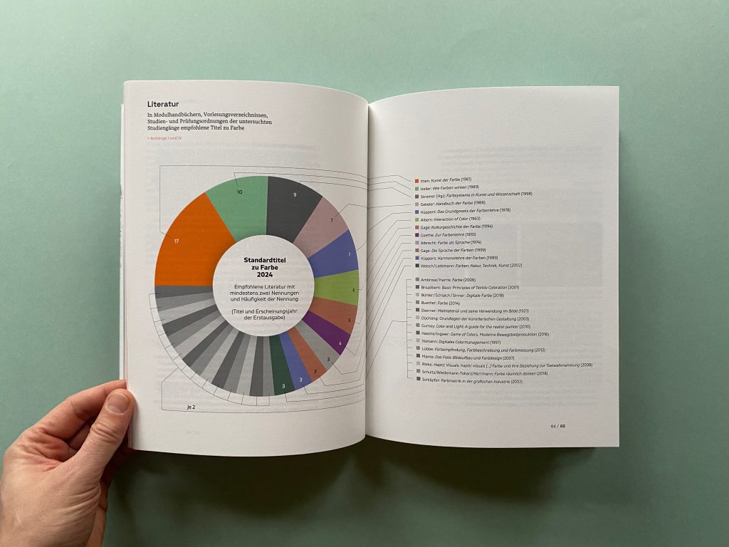
The first part collects data on how the subject of color is currently taught in design courses at public universities and art schools throughout Germany. Module handbooks, course plans, study and examination regulations, websites of the universities and the courses as well as lecture lists are scanned for keywords on color and evaluated. In addition to design courses, the courses examined also include architecture, interior design, fine arts, art education, and restoration.
The second part looks at historical traces leading to our reservations about color. Various strands from Plato’s criticism of images to the false assumption of white (unpainted) Ancient Greece and Rome, or the debate about the priority of drawing over color (disegno vs. colore) are examined and put into perspective regarding the current teaching situation of color in design courses.
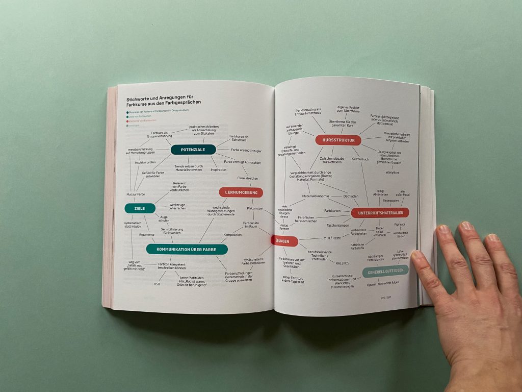
The third part contains interviews with color teachers and design graduates from different courses (media design, communication design, product design, color design, architecture, interior design, restoration). They are asked about details of their color classes, or the color classes they experienced during their studies. The results are again evaluated.
The last part sums up results from the research, literature, the interviews, and my own teaching experience and explores tendencies and future fields of action regarding color and color classes.
On a personal level, this master’s thesis served to update and enrich my own color teaching. Closely linked to this was, and remains, the desire to dispel my students‘ apprehension about color. The research, the exchange with other color educators, and the events organized by DFZ proved exceptionally fruitful.
Almost unexpectedly, they led to the development of a professional network, which already bore fruit this semester: Together with RAL Farben, an intense one-day workshop on color was conducted for design students with no prior knowledge. I intend to systematically test the many suggestions and ideas gathered during the course of my master’s thesis and integrate them into my color courses in the coming years, thereby developing an updated color curriculum. This work marks the beginning of that endeavor.
::